In what ways will your media product use, develop or challenge forms and conventions of real media products?
žI plan that the outcome of my magazine will relate to existing magazines such as Natty Dread and Reggae United. The representations will be use conventions such as the styles, range of colours and ways in which they captivate their audience.

žAs there are not many magazines targeted for people who like reggae music, this magazine will attract a wide audience because it is a unique type of magazine.
How will your media product represent particular social groups?
žI plan that my magazine will represent both male and females who enjoy listening to reggae music.
žI want the representations in my magazine to be positive unlike many representations of Caribbean reggae artists of today.
žThis magazine will show that Caribbean artists can achieve something in life and that they use this to reflect on others around them.
žIt will also give Caribbean people a sense of belonging because they have something that is related to their culture.


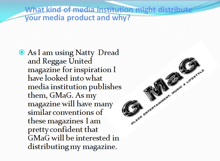
What kind of media institution might distribute your media product and why?
žAs I am using Natty Dread and Reggae United magazine for inspiration I have looked into what media institution publishes them, GMaG. As my magazine will have many similar conventions of these magazines I am pretty confident that GMaG will be interested in distributing my magazine. Also, this company deals with black entertainment so they would know how to distribute it to the right kind of target audience.
Who would be the audience for your media product?
žMy new music magazine will be aimed at Caribbean people who like to listen to reggae music aged 4o and over. However, this magazine will not discouraged any others who may feel they are interested in it. This that if any other person would like to buy this magazine, they are free to.
How will I attract or address my audience?
žI will attract my audience visually by using bright colours that relate to the Caribbean such as red, gold and green.
žI will also make sure that colours are consistent throughout my magazine.
žOn my front cover I will have a strong, eye catching picture of my artist.
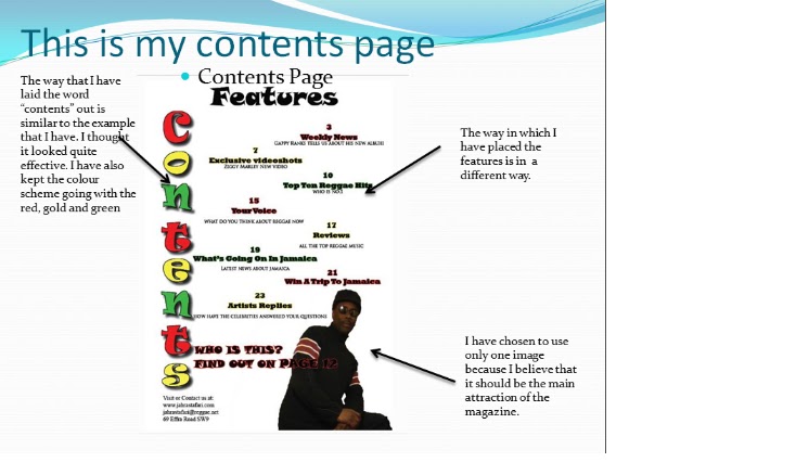
žOn the contents page I will keep the writing as simple as I can and use one image so that I keep the readers engaging and also in suspense.
žOn my feature page I will include more than one picture so that the readers don’t just see the text.
žAfter doing all this, I am sure that my target audience will be attracted to this magazine and it will appeal to them because it will be something that they can relate to.
What have you learnt about technologies from the process of construction this product?
What have you learnt about technologies from the process of construction this product?
—When starting AS Media I had some knowledge and experience with the program Photoshop as I used it a few times at my secondary school, but this was very limited because we only used it for a couple of hours. However, I had never worked on producing a magazine before. I have learnt it takes a great deal of skill, time and effort to create a magazine that could potentially be successful.
—I had no experience with using InDesign and I believe that my skills have developed a substantial amount since the preliminary task. I learnt how to use the different layers to add text, images and different gradients in order to produce good quality in my magazine. Below are 3 of the stes that I had to take while creating my magazine using InDesign.


—I had no experience with using InDesign and I believe that my skills have developed a substantial amount since the preliminary task. I learnt how to use the different layers to add text, images and different gradients in order to produce good quality in my magazine. Below are 3 of the stes that I had to take while creating my magazine using InDesign.


—I have found Photoshop very useful when editing my photos. Even though I didn’t change my photos too much, I still learnt how to change the brightness, the gradient and remove the background of my photos and manipulating them. Also, I learnt that I didn't need to hange my photos dramtially in order for them to look good.
Looking back at your preliminary task, what do you feel you have learnt in the progression from it to the full product?
—I think that I have improved quite a lot since I started the preliminary task. I have developed my skills using PhotoShop and InDesign.
—I have also learnt that to make the photos look more effective, I had to change the way that they look. This can change the way that the audience looks at the photo .
—In the production of the magazine, from the preliminary task, I have learnt to colour coordinate more so that the magazine looks more attractive to my audience. Colour coordination makes my front cover look more appealing and eye catching. This technique also made my front cover, contents page and double page spread look more professional.
—Although I only used a limited amount of tools on the programs, I learnt how to use them effectively. I showed that I didn't need to use all the tools to create an effective photo.


