Today I have to piece together my presentation for the magazine. This will be slides 6-10. I have to find 3 other photos that I took, manipulate them in Photoshop, place them in the presentation and then state how and why I have manipulated them in that certain way.
While I wait for the photos, I have decided to move on to the next 5 slides as I have conducted more research for the contents page. I have included the examples of contents page that I looked up on google.
Friday, 28 January 2011
Sunday, 23 January 2011
Main Task: Reggae Contents Page 20th-21st Jan
Since the deadline is the 21st, I have finished adding the main text for the contents page. Now I have to try and find a background that would suit the colours of the contents page. I believe that something that is not too overwhelming will be more effective because I want the readers of the magazine to be drawn to features of the magazine and not the background. I think that the background should be simple and I want it to gradually build up the gradient of the background effective.
I have completed my contents page and I have decided to leave the background white. The reason for this is because while I was trying out different colours, I didn't think that they looked good enough for the magazine.
Looking back at the preliminary task, I feel that I have improved my skills in using Photoshop and InDesign firstly because I have proved that can use Photoshop because I have removed the background from the image that I used for the front cover and contents page. Next lesson I am hoping to complete my presentation for the reggae magazine.
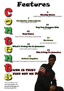 This is the contents page for my magazine. I think that the background should be a different colour as it looks a little bit plain. However, I like the way that hte white background makes the text stand out and jump off the page.
I have completed my contents page and I have decided to leave the background white. The reason for this is because while I was trying out different colours, I didn't think that they looked good enough for the magazine.
Looking back at the preliminary task, I feel that I have improved my skills in using Photoshop and InDesign firstly because I have proved that can use Photoshop because I have removed the background from the image that I used for the front cover and contents page. Next lesson I am hoping to complete my presentation for the reggae magazine.

Friday, 14 January 2011
Main Task: Reggae Contents 13th-14th January
I have also started to add some information to my contents page such as the regular features i.e. weekly news, exclusive videoshots. Plus, competitions to go the Caribbean or meet Reggae Stars. I have been trying to find the right text for the contents page so that it contrasts with the front cover. In addition, I want to change the background colour by starting to slowly add more colour to the background and gradually the colour gradient will increase. I don't want the same background colour for the whole of the magazine because I don't want it to look plain and boring which white can be when used excessively.
Friday, 7 January 2011
Main Task: Reggae Contents Page 6th-7th January 2011
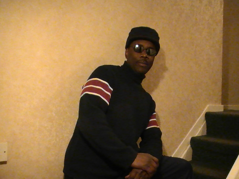
Today, I started to create my contents page. I have done this by starting to add some text to my page. For examaple, I have typed the words CONTENTS on the side of the page (like the design layout 1 on the 17th of December). I have made the letters look like the masthead on the front cover. the colours and effects on the text are the same. I am trying to make sure that the colours, fonts and styles flow throughout the magazine. I have added a photo of the main cover star Jonny Roots. However, the cover image is of Jonny Roots when he was younger. The image in the bottom right of the contents page is the mature Jonny Roots and what he looks like now. I have chosen to do this because when the readers look at the contents page and see the photo, the question next to it says "Who is this?" This will make the audience want to buy the magazine and go to the double page spread to find out who it is. I have decided to make the magazine have about 30 pages in it because I want the reader to want to be able to feel as though they have to buy the magazine every month so that they keep up with the latest news. I want the audience to feel like the magazine is not enough for them and they crave for more.
Main Task: 16th -17th December 2010 Music Magazine
Today, I have completed the front cover of the magazine. I have decided that the background will stay white because of the research that I have done, I have found out that the magazine backgrounds are kept plain and simple. This may because the publishers want to keep the main focus on the main cover image.
 For the picture, I took it and then transferred it to my phone where there are effects that have made it look like an old photo of the main cover image. This because the content of the article is that Jonny Roots is a n artist who was big back in the 80's and this image represents that. The recent image of him is different by the clothes and the setting of the background. Here is the first draft of the front cover.
I also started to research different contents page layouts to try and get an idea on how to set my contents page out.
This is one of the first designs that I have chosen to research. I quite like this design because of the large title of the word CONTENTS. It is not the usual way that the contents page looks like. I think that I will take this idea and develop the design as I go along. I have taken this image from the website: urnstrum.wordpress.com.
The second design that I have chosen is quite interesting because it has quite a lot going. This could be effective because it gives the reader all the information that they are going to read about. However, I think there is too much going on in the contents as I believe that there is too much information being given. I believe that the reader should should be kept guessing about what they are going to read. I have taken this image from the website: http://qwickstep.com/search/layout-of-magazines.html?p=8
 |
| Layout 1 |
Subscribe to:
Comments (Atom)